Coke debuts new look to unify brand

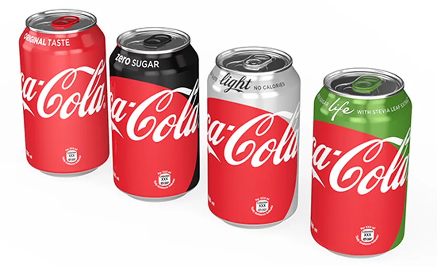
International beverage giant the Coca-Cola Company is giving its flagship beverages a makeover, extending the company’s “One Brand” global marketing strategy. Cans and bottles of its signature Coke, Diet Coke, Coke Zero and Coke Life will be unified under one visual identity system prominently featuring the Coca-Cola Red color.
The Red Disc, the signature element of the new “Taste the Feeling” global creative campaign launched in January, will now appear prominently on packaging. The company says the new packages were designed to enable consumers to choose the Coca-Cola that best suits their taste, lifestyle and diet. This unified design marks the first time the 130-year-old company has incorporated a shared identity across products in such a prominent way, according to James Sommerville, vice president global design, Coca-Cola.
“Packaging is our most visible and valuable asset,” says Marcos de Quinto, CMO, Coca-Cola. “The Coca-Cola Red Disc has become a signature element of the brand, synonymous with great taste, uplift and refreshment. By applying it to our packaging in such a bold way, we are taking the next step towards full adoption of the ‘One Brand’ strategy, uniting the Coca-Cola family under one visual identity and making it even easier for consumers to choose their Coca-Cola with or without calories, with or without caffeine.”
New packaging will be available in stores in Mexico the first week of May. Similar versions of the Red Disc graphics will roll out into additional markets around the world throughout 2016 and into 2017.
Looking for a reprint of this article?
From high-res PDFs to custom plaques, order your copy today!


-Monaco_Cocktails.webp?height=200&t=1690903140&width=200)


